Well Hello there,
Considering it’s about -4 outside as I write this I’m glad to see some bright colors… I’m hoping that it gets warmer soon! I know alot of these colors weren’t what we were hoping for however some are really pretty and with all the old colors that have been discontinued hopefully these can replace those colors we lost.
All of these colors unless noted only needed 2 coats, the application was great! Zero shrinkage and even the white was 2 coats and done. Love that! I feel like OPI has finally solved all those application issues that were occuring YAY!
Release Date: Febuary 2018
Click here to find out where to purchase products

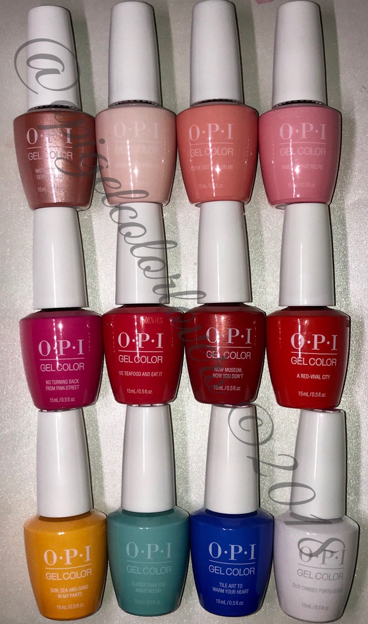
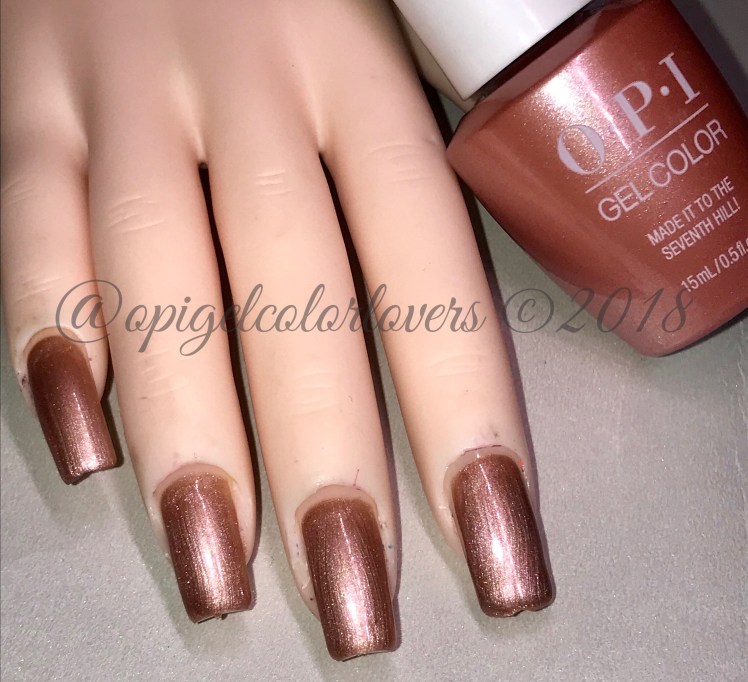
Swatches:Made It To The Seventh Hill!
I really love this color, it’s like a rose gold copper. I just love it!! There will be some brush lines but I didn’t notice them with a top coat.

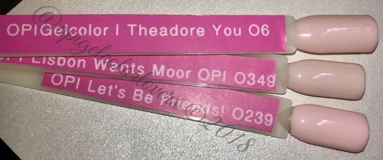
Lisbon Wants Moor OPI
So I know that Lets Be Friends (Hello Kitty) was a favorite and has been discontinued, I was hoping this would be a replacement for that but I dont think its as pink. I did compare them below so be sure to check it out. This is a creme no shimmer and applied like a dream too.

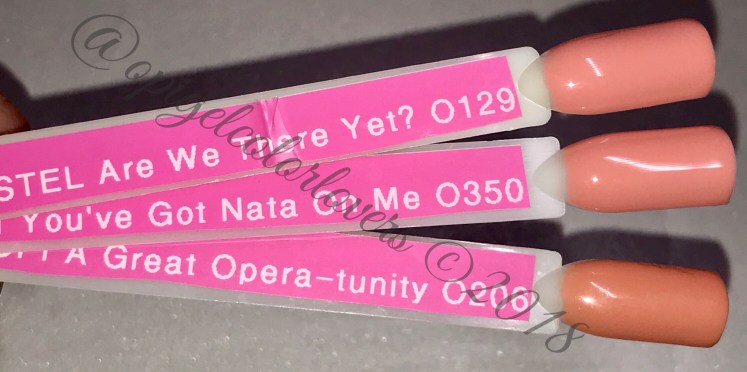
You’ve Got Nata On Me
Another creme it’s a peachy pink coral type color, applied great.

Tagus In That Selfie!
Haha I love this name! This bubble gum bright pink will be great for summer! It applied great too.

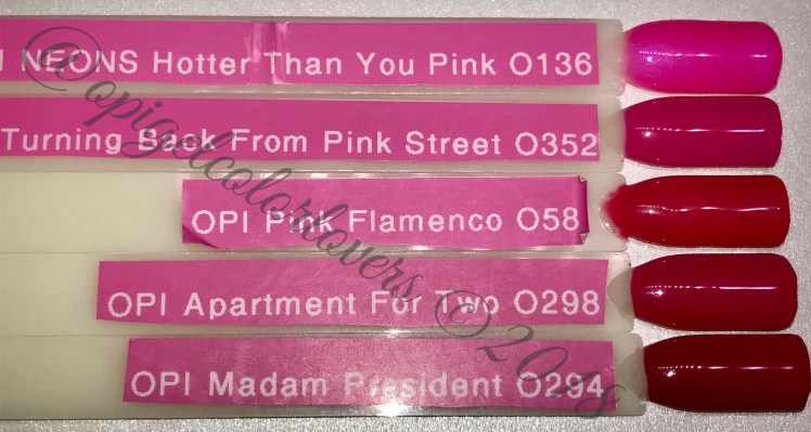
No Turning Back From Pink Street
Wowzer! When I first painted this it was so bright it could have pasted for a creme neon. with the camera it looks like it toned down slightly.

We Seafood And Eat It
Haha tha names craack me up ha! It’s another creme and reminded me of Cajun Shrimp… I still love these corals they always sucker me back in. One color I Can never have too many of.

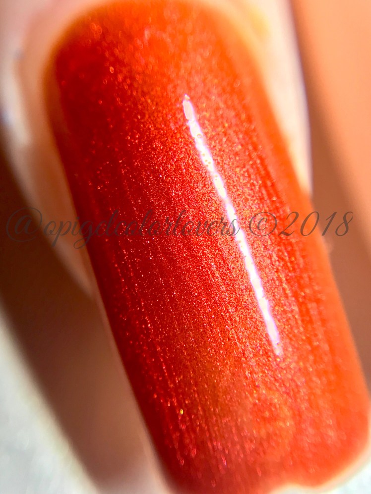
Now Museum, Now You Don’t
Oooooo this was just GLOWS! It’s firey red-organge beautifulness… Actually i almost feel like this could go for Spring or Fall. This one does need three coats because the first coat is alittle sheer but it pays off!

A Red-Vival City
This is another OPI Red. It almost seems more orange-y red to me instead of a true creme red, but none the less still pretty.

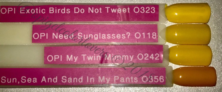
Sun, Sea And Sand In My Pants
HAHAH another great name…. But I don’t really feel like we needed more yellows… It’s a great bright sunny yellow creme

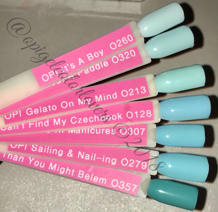
Closer Than You Might Belem
This is a really pretty teal/blue creme, It is similar to some other blues that are around. I feel like its lighter in person and seems darker in these photos.

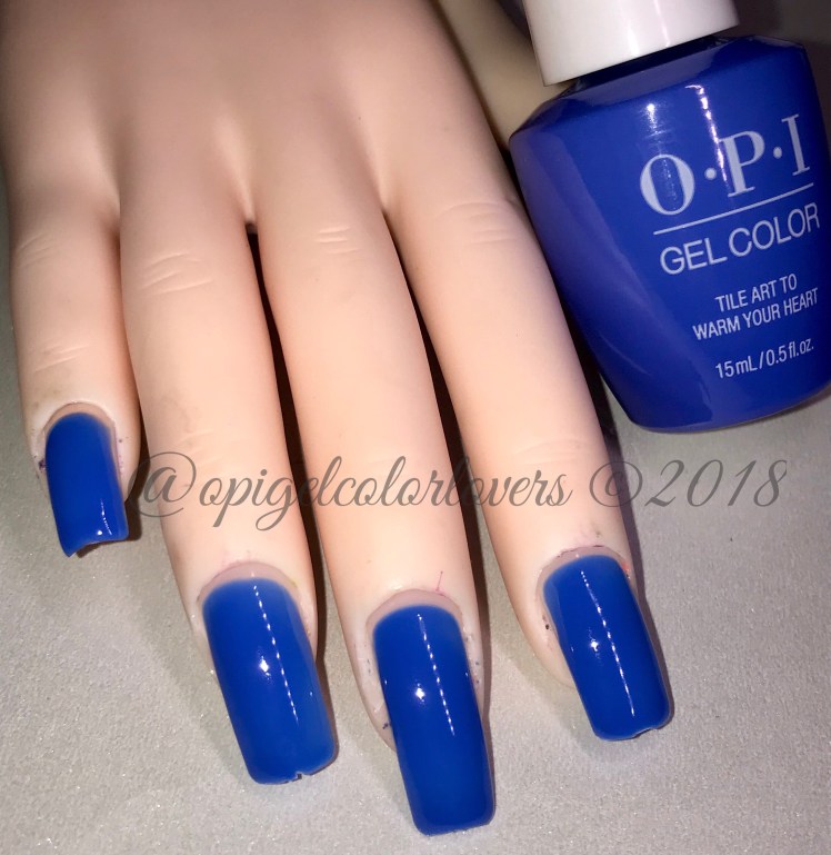
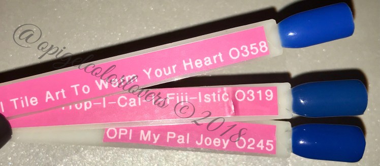
Tile Art To Warm Your Heart
Whoa where are my sunglasses! This is a BRIGHT blue creme, for me it would be great for accent nails but might be alittle too blue for me!
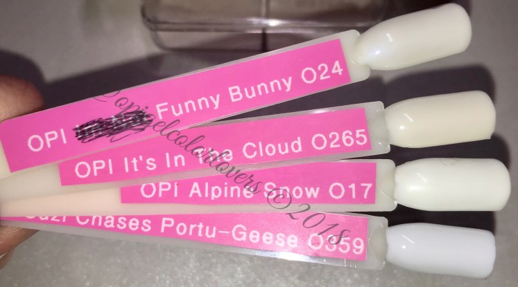
Suzi Chases Portu-Geese
I love this white! Its more of a cool white that warm so more blue under tones, but it was good to go in two coats which is almost unheard of for whites!

Comparisons:


15 thoughts on “2018 Spring: Lisbon”